
The Hottest Pastel Color Combinations for 2025
Pastel colors are making a huge comeback in 2025, blending soft tones with elegant expression. These soothing shades are dominating graphic design, fashion, interior decor, and branding. Whether you’re a designer or just someone who loves beautiful color aesthetics, these palettes offer a fresh source of inspiration.
Here are the top trending pastel color combinations for 2025 and how you can use them to enhance your designs:
1. Serene Seaside
Inspired by ocean breezes and soft horizons, this combination features muted aquas, sandy beige, and whisper blues creating a calm and coastal feel.
- Use in: Wellness brands, summer-themed packaging, beach resort ads
- Palette: Powder Blue, Seafoam Green, Sandstone Beige
2. Blooming Blush
Perfect for romantic and feminine aesthetics, Blooming Blush includes gentle pinks, dusty roses, and warm ivory.
- Use in: Beauty product design, wedding invitations, fashion lookbooks
- Palette: Rose Blush, Cream Petal, Soft Mauve
3. Minty Fresh
Bright and invigorating, this palette combines cool mint greens with pastel yellows and icy whites, bringing a refreshing twist to minimalism.
- Use in: Tech packaging, healthcare branding, wellness app UI
- Palette: Mint Green, Lemon Sorbet, Ice White
4. Desert Dawn
A warm, earthy selection inspired by sunrise in the desert, featuring terracotta blushes, light amber, and creamy peach tones.
- Use in: Editorial layouts, sustainable product branding, lifestyle blogs
- Palette: Soft Terracotta, Blush Peach, Desert Sand
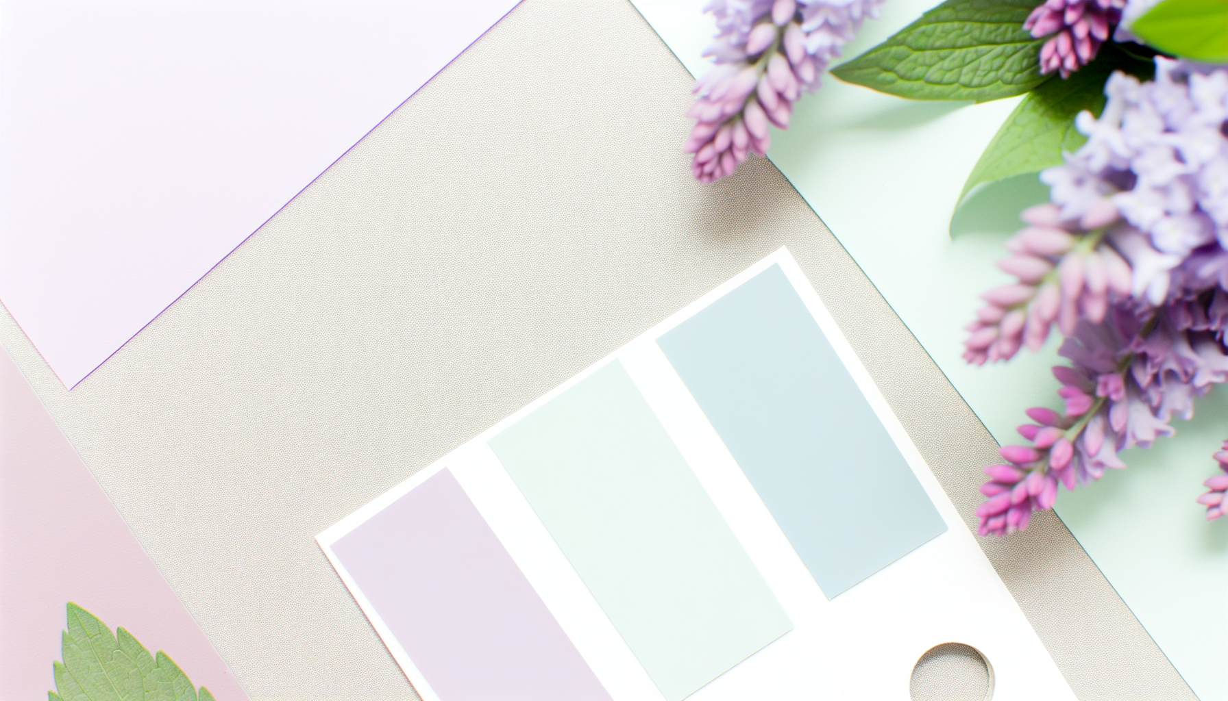
5. Lavender Dreams
Delicate and dreamy, with pale purples, iced lilacs, and hints of baby blue, this palette taps into a sense of calm creativity.
- Use in: Spa branding, therapeutic product design, creative portfolios
- Palette: Lavender, Lilac Mist, Baby Blue
6. Cotton Candy
Playful meets pastel with this sugary-sweet blend of bubblegum pink, baby blue, and soft lemon.
- Use in: Children’s branding, social media graphics, event flyers
- Palette: Bubblegum Pink, Sky Blue, Pale Lemon
7. Spring Revival
Fresh and optimistic, Spring Revival features grassy greens, soft corals, and gentle butter tones—making it perfect for seasonal campaigns.
- Use in: Eco-friendly packaging, spring campaigns, lifestyle products
- Palette: Pastel Green, Coral Blush, Sunbeam Yellow
Why Pastels Matter in 2025
Pastels reflect the growing desire for calm, balance, and well-being in the modern world. Their muted softness conveys stability while still offering versatility and vibrancy. Designers are using them for everything from user interface design to print materials as a way to connect emotionally with audiences.
Final Thoughts
Whether you’re revamping a brand identity or selecting colors for a new web product, these 2025 pastel color combinations provide a rich starting point. Dive into the gentle power of pastels and breathe new life into your creative work.
Leave a Reply